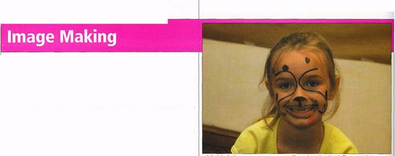
This birthday snap was appealing, but looked flat. And it should have been shot vertically, closer to the subject.
It was easy to crop out the distracting background.
In the Digital Darkroom
With conventional photography, we accept the fact that many pictures don't come out the way we'd like. With digital photography, you don't have to be satisfied with the way the image comes out of your camera.
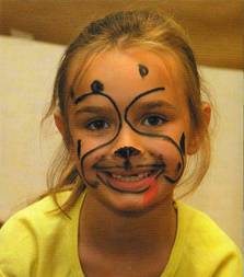
This digital snapshot, taken after some face-painting at an eight-year-old's birthday party, was certainly appealing. Instead of the camera's built-in flash, I used an external flash, which I tilted upward so as to bounce the light off the ceiling. Compared to direct flash, bounce flash delivers softer, more three-dimesional lighting. You don't get red-eye or unnatural shadows behind your subject, as you often do with direct flash.
But there were problems. I should have shot vertically, and zoomed in closer to focus attention on the little girl's face. Also, the image was a little flat-looking.
Three or four minutes with an image-editing program fixed both problems. First, I used the crop tool to get rid of the extraneous background. Then I adjusted the tonal values of the image.
All image-editing programs have brightness and contrast controls for adjusting tonal balance. Using them is usually a matter of trial and error. Unlike a regular darkroom, with computer-based image editing you can see what you're doing. If you don't like an effect, dick the cancel button or use the undo option.
With the Levels function in Adobe Photoshop Elements (choose Adjust Brightness / Contrast, and then Levels, under the Enhance menu), you can adjust tonal balance far more precisely than you can with brightness and contrast controls. When you choose the Levels function, you see a graph called a histogram, with slider controls at the bottom. The histogram shows the distribution of dark, mid-tone and bright areas in the picture.
In this image, there are no very dark (black) or very bright (white) areas, which accounts for the lack of punch. I dragged the left-hand slider, which controls the black level, slightly to the right; and dragged the right-hand slider, which controls white level, slightly to the left. In both cases, I moved these controls just to the threshold of the histogram; that way, I didn't sacrifice any shadow or highlight detail. But I did add a fair measure of punch to the picture, because it now contains more bright and dark areas, instead of just mid-tones. My final adjustment was to brighten the image a little, by moving the middle slider (which controls mid-tones) slightly to the left.
The end result: a picture that comes far closer to what I had in
mind when I pushed the shutter release.
— Cordon Brockhouse
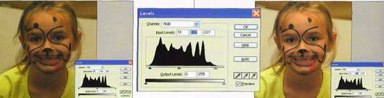
Using the sliders in Photoshop Elements' levels function, it was easy to adjust the tonal range precisely, adding bright and dark areas to a picture that contained mainly mid-tones.
Back to Menu