Painting with Light
by G B
Have you ever noticed that when you photograph people in bright sunlight in mid-afternoon, they end up with odd-shaped dark shadows obscuring their faces? The shadows are cast by the subject's nose, brow, hair or a hat. Sometimes faces are scrunched up too, squinting against the bright light. None of which makes for very attractive portraits.
You can just toss those pictures aside, or shuffle them to the bottom of the deck. But why not learn from the mistake? It isn't some unpredictable combination of circumstances that produces such duds. Portraits taken in bright sunlight hardly ever work.
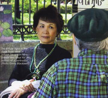
The simplest solution: don't take them! Move your subject into the shade. Unlike direct sunlight, shade or skylight is diffuse. There are no direct rays. Instead, the light comes
from many directions at once, so it doesn't cast harsh shadows.
The word "photography" comes from the Greek photos meaning "light," and graphein, "to draw." When you take a photograph, you're drawing with light. So to take good photographs, it follows, you need to know a little about how light works, and learn to manipulate it.
The Quality of Light
Colour: Do this experiment: pick a sunny day and, starting at dawn, photograph the same scene from the same set-up position every hour on the hour until after sunset. Use a tripod. Print the pictures or look at them on your PC screen. What do you notice?
The colour in every picture will be slightly different; and some pictures will be wildly different in colour. What happened? Did the objects change? Obviously not. Only the light changed.
You could extend the experiment one hour after sunset, using a flash, and you'd notice the objects take on drastically different colour characteristics again.
Or try this. Place the same object (a vase, say) in different lighting situations: direct sunlight, shade, cloud, fluorescent light indoors, incandescent (a standard light bulb), camera flash and so on. Photograph the object at the same size and position in the frame with as neutral a background as possible. The results will be the same as in the first experiment: colour in every picture slightly different.
Light from different sources or coming from different directions clearly changes colours in a scene in subtle and not-so-subtle ways. The reason: perceived colour is only partly a function of innate light-reflecting properties of objects. It's also a function of the colour "temperature" of the light itself, which imparts its own qualities.
You can see these differences with the naked eye, but we tend to disregard them because it's not particularly useful information. Unless you're a photographer, or an artist.
The French Impressionist artist Claude Monet was obsessed with the way light changes colour and surface appearance. He painted several series of pictures of the same subject — a hay rick, Rouen Cathedral, a bridge over a lily pond — to study and illustrate the effects of light at different times of day and in different atmospheric conditions.
Time of day: You don't need to go to those lengths, but one thing you'll notice if you actually do the first experiment is that not only are the colours different in each picture, but also some just look better, most notably, the ones taken soon after sunrise and just before sunset.
The colours in those pictures will have an attractively rosy or buttery hue; and there will be fewer harsh shadows. Both effects are because sunlight early and late in the day is more diffuse because of the low angle of the sun's rays and the fact it's passing through more of the earth's atmosphere.
Late and early sunlight also delineates contours in attractive ways, making them look more three-dimensional. While there is some shadowing which gives the sense of three-dimensionality, the shadows are not so dark that they mar the composition.
Secrets of the pros #1: Pros do most of their shooting early or late in the day to take advantage of favourable lighting. There is no reason the rest of us can't do the same.
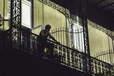
Good shadows: This is not to say that you should stop photographing in the middle of sunny days, or that shadows are never a good thing. Sometimes they create drama and contrast that you want.
The trick is to make them part of the composition, not just something you overlooked that throws the composition off. Look at the accompanying abstract streetscapes taken in the French Quarter in New Orleans.
Weather: As Monet knew, it's not just time of day. The quality of daylight also varies infinitely according to atmospheric conditions.
Many people believe they need bright sunlight to get good colour in pictures. The exact opposite is in fact true. Bright sunlight washes colours out. Besides the other benefits of diffuse, indirect light we've already noted, cloudy or shady conditions almost always produce richer, more saturated colours.
Misty days are also surprisingly good for photography. Light filtered through the mist is soft and diffuse. Of course, much of the light is blocked, so in order to capture the effects of mist and fog, you'll probably have to use a tripod to accommodate the slower shutter speeds required.
Secrets of the pros #2: Pros always carry a tripod and use it often. Even a lightweight, easy-to-carry model like the one I use, a Giottos RT-8000 (about $50), can save you in low-light situations.
 Direction
Whatever its source or colour, the direction from which the light comes has a huge impact on how your pictures look: the level of detail in different parts of the scene, the sense of depth and three-dimensionality and shading. The sun-portrait problem in the first shooting situation is an extreme example.
When the sun is directly overhead, it tends to flatten objects and rob them of three-dimensionality. This is why landscapes taken in the middle of the day rarely work well; there are no shadows to reveal the contours of the land.
Back lighting will throw a foreground subject into deep shadow, which can be good for creating dramatic silhouettes, but lousy for most other purposes because almost all detail in the foreground is lost.
A light source straight in front, like a flash, is good for showing detail and texture in relatively two-dimensional objects, but isn't flattering in portraits. And if it's bright sunlight, it will make your subject squint unattractively.
Side lighting can create interesting effects with one side of the subject in shadow, and the other side showing good detail. But if the light source is too bright, it will be difficult or impossible to properly expose the bright side without rendering the dark side as almost black.

Direct sunlight is not good for portraits, but in these streetscapes taken in the French Quarter of New Orleans, the stark shadows created a compelling/y dramatic effect. (Photo: G B/ackwell)
Manipulating Light
You can take better pictures by learning to choose the best lighting for the shot but, of course, you won't always have a choice. You can turn difficult lighting to your advantage, though, using fairly simple tools and techniques.
Out damn shadow: Shadows are the bane of a portrait photographer's existence. What do you do in the first shooting situation we described if there is no shade in which to place your subject?
Professionals, with assistants, sometimes use translucent fabric filters placed in the path of the direct rays of the sun to diffuse the light falling on their subject. This may be difficult for amateurs to manage, but not impossible.
Something as simple as an old sheet held up by a couple of friends standing on chairs or step ladders can sometimes do the trick. And sunlight filtered through a white sheet may actually provide more flattering and colour-neutral light than shade from a tree or building.
Reflectors: Or you can use a reflector to bounce sunlight (or any light) onto your subject from a compensating angle. If sunlight is streaming down from fairly high, for example, reflecting light up from below will soften shadows cast by the sun. You can purchase purpose-built reflectors at specialty camera shops. Parabolic and elliptical reflectors in various portable sizes, colours and finishes sell for between $30 and $150.
Secrets of the pros #3: Pros frequently use multiple light sources to modify effects of a primary source and generally create more even lighting.
Fill flash: A simple way to reduce shadows in contrasty light-
ing conditions: use fill flash. Many digicams have a fill-flash mode, sometimes just called "On" or "Automatic," in which the flash will always fire on low power even when there is enough light in the scene to take a shot without flash.
Fill flash provides supplemental light to brighten shadow areas. You will need to experiment with it. While the fill flash is designed to provide an appropriately small amount of extra light, it won't always give you the effect you want.
Slave flash: Slave flash, a secondary flash unit set to fire in response to a pulse from the camera's main flash, can carry the notion of fill flash one step further.
Vivitar makes two slave flash products especially for digital cameras. The compact DF120 (about $55) mounts on your camera using the supplied bracket, or on a separate mini-pod. The more powerful DF200 ($120) fits in your camera's flash hot shoe, if it has one, but doesn't work with the camera's electronics. The DF200 also comes with a bracket and mini-pod.
Using the mini-pod, you can set up these units away from the camera on any flat surface at an angle to the axis on which you're shooting. The idea is to angle the slave flash to compensate for uneven ambient lighting.
For example, if you're shooting a side-lit subject where the ambient light is enough to give a good exposure on the well-lit side, you could place the slave flash to point at the shadowed side. This won't necessarily create perfectly even lighting, but you probably don't want that anyway.
You will need to experiment with pointing the slave flash, but you can also use it (or more than one) to fill in the background to eliminate or at least soften the often harsh shadows cast by the built-in flash.
Bouncing flash: Another way to eliminate flash shadows: bounce flash off a ceiling or wall. The light as a result is more diffuse and to the extent that it does cast shadows, they will not be directly behind the subject but lower or off to one side, and with luck, out of the frame.
You can only bounce flash if you have a flash unit with a head that swivels. We've seen only two digi-cams with built-in bounce flash: Panasonic's Lumix DMC-LC1 and its fraternal twin, Leica's Digilux 2. But if you own a mid- to high-end camera with a flash hot-shoe, you can purchase a swivel-head flash unit that will fit in the shoe and become the camera's main flash, working with its through-the-lens (TTL) flash-metering system. The camera maker probably sells a unit that will work with your model. Some third-party manufacturers, such as Metz and Sigma, also have units that work with selected digi-cam makes and models.
The Vivitar DF200 has a swivel head and can be set up to do bounce flash, but your camera's built-in flash will also fire straight ahead, so there will still be some shadowing.
Bounce flash can produce very evenly lit indoor shots, but you need a light-coloured ceiling (ideally white) that is not too high and not too low. Then you need to ensure that the flash head is set at the right angle given your distance from the subject.
Filter Tips
In traditional photography, film emulsions are designed to produce optimally natural-looking colour in one particular kind of light, usually either daylight or tungsten (studio lights). You compensate for the colour-altering effects of other light sources using tinted glass filters that screw into the end of the lens.
For example, images shot on daylight film under fluorescent light have an unappealing green cast. Mounting a fluorescent-daylight filter in front of the lens reduces this effect. Ordinary incandescent light produces a pronounced yellow cast when you use regular daylight film; you can largely eliminate this effect by using a blue filter.
These problems are greatly reduced with digital cameras because digital photo sensors, unlike film emulsions, can be adjusted for the type of light on a shot-by-shot basis. In fact, most digicams automatically adjust their white balance to accommodate the prevailing type of light. Many digital cameras also let you set white balance manually, by choosing settings like tungsten, fluorescent and daylight. Some models let you create "custom" white-balance settings. To do this, you shoot a picture of a white or neutral-grey object; the camera then sets white balance precisely for your current lighting conditions. Especially indoors when you're not using flash, setting white balance manually will often produce pictures with more neutral-looking colour.
You can also correct for many of the most serious light-colour effects using colour balance and hue controls in photo editing software.
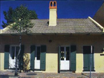
 The brilliant blue sky in this photo would have been
washed out
and closer to white without the polarizing filter. The filter has also reduced glare from the yellow house
front. (Photo: G B)
Polarizer: There is only one filter you absolutely must have for digital photography: a polarizer. In fact, it may be the single most important investment in equipment you can make after the camera itself.
Polarizing filters block or reduce glare from the sky and reflected from shiny surfaces. That glare robs colours of their richness and saturation and often creates burnouts: areas in a picture rendered pure white. Polarizing filters will eliminate or reduce these effects.
Take a look at the accompanying picture of a French Quarter house in New Orleans. The rectangle of brilliant blue sky would have been washed out and closer to white without the polarizing filter, which would have altered the composition for the worse. The filter has also reduced glare from the yellow house front, though this is less noticeable.
Only polarizing filters will do this. You cannot create the same effects using software, at least not easily.
Appropriate screw-in polarizing filters for digicams cost between $20 and $90. You may also need an adapter for your digicam to accommodate the filter.
If your camera's lens does not have threads at the end for adapters and filters, you can use a kit from Cokin ($40) that mounts a filter holder using the tripod port on the bottom of your camera. You buy the polarizing filter (just a piece of glass) separately ($40).
The advantage of the Cokin kit is that you can use other filters in the holder and change quickly by sliding one out and another in.
We've obviously only scratched the surface here. Books have been written on the subject. For a different take on some of the basics, check out this primer by advanced amateur photographer Philip Greenspun at his excellent Photo.net site (http://www.photo. net/making-photographs/light). For an interesting discussion of how the direction of light effects results, surf to http://www.megapixel.com, click on Articles and select "The effect of light direction" from the Camera Basics pull-down list.
But the best way to learn is to practice and experiment, which is especially easy with digital photography. •>
Using
your camera's flash outdoors can help fill in shadows in contrasty
shooting situations. The first picture was shot with daylight only, and the
second with fill flash.
Send in the Clones
How to remove distracting objects from your digital photos
Often when we snap a picture, we don't fully see the scene in front of the camera. A landscape that seems pristine and unspoiled may have hydro wires cutting across the horizon. You may not notice this distracting piece of modernity when you're peering through the viewfinder; but there it is in your print, spoiling the overall effect.
Another common problem: a portrait with a distracting object directly behind your subject. A pole or tree might seem to be growing out of the head of a person in your picture.
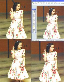
That's exactly what happened in an otherwise-charming picture of my daughter, taken during a birthday celebration in a church hall. The handrail in the background looks as if it's sprouting out of my little girl's head.
Instead of deleting the picture, I decided to remove the handrail, after the fact. Most image-editing programs have a clone feature that lets you substitute one area of the scene for another. Some programs call this a "clone brush"; Adobe Photoshop, which I used to make this correction, calls it the "clone stamp."
It works a little like the eraser tool in paint programs like the one that comes with Windows. As with Paint's eraser tool, you move the clone brush over the area you're trying to remove. But instead of just deleting the area, and leaving a blank spot in its place, the clone tool substitutes an adjacent portion of your image for the one you're removing. In a landscape, you might use the clone brush to substitute clear blue sky for those distracting hydro wires.
With this picture, I selected an area of the red concrete-block wall in the background, and then painted over the handrail. As I moved the mouse, Photoshop painted a red wall where the handrail had been.

You can choose various options for this operation, including brush size (a smaller brush allows finer correction, but takes more time) and opacity. In this case, I wanted the red wall to completely cover the handrail, so I set opacity to 100 per cent. If I'd wanted, I could also have removed the vertical portion of the handrail by cloning in the red wall in the upper part and the terrazzo floor in the lower part. And if I'd wanted to go whole-hog, I could also have cloned out the electrical outlets in the background to the right. But I was sat-
isfied with having removed the diagonal portion of the handrail from my daughter's noggin.
The process is a little fiddly. For example, if you don't move the mouse finely enough, the object you're trying to remove may be shifted over because you're cloning the offending object to another adjacent area. But for anyone with a reasonably good eye and firm hand, it takes only a little practice to nail down this technique.
A distracting handrail, which seems to grow out of this little girl's head, was removed using the clone stamp tool in Photoshop. This feature lets you substitute an adjacent portion of the image (in this case, the red wall in the background) for another element (in this case, the handrail) simply by drawing over the unwanted object. <left>
Back to Menu